


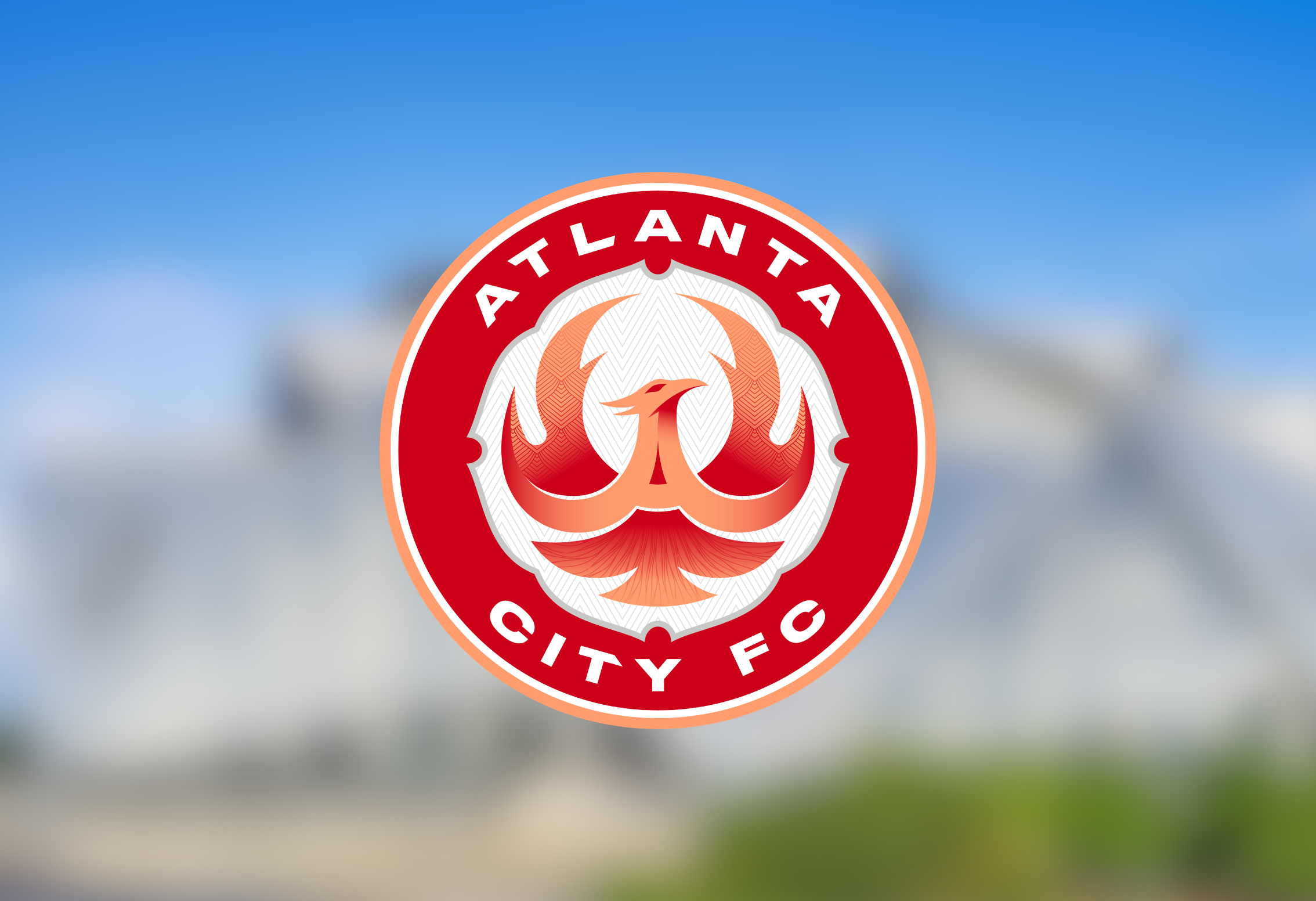
Atlanta’s newest professional soccer club officially has an identity. Atlanta City FC unveiled its name, crest and colors on Monday as the organization continues preparations for its first season in the National Women’s Soccer League in 2028. The club’s branding was built around Atlanta’s history and identity, incorporating several symbols connected to the city. At the center of the crest is a phoenix, representing Atlanta’s history of resilience and reinvention. The design also incorporates a dogwood flower, roots and a hidden “A” within the phoenix. Atlanta City FC will use four primary colors: Atlanta Red, Georgia Peach, Platinum Metallic and Black Char.

According to the club, the identity was developed with feedback from local soccer supporters, founding member deposit holders and community leaders. The launch represents another major step toward Atlanta City FC’s arrival in the NWSL. The organization was awarded an expansion franchise in November 2025 and has continued building its front office and infrastructure ahead of its inaugural season. The club is also planning a public launch celebration on Oct. 4 in downtown Atlanta, where supporters will be able to see the new branding and purchase the first official Atlanta City FC merchandise. Atlanta City FC will now spend the next two years continuing to build the organization before taking the field in 2028. For a city already home to one of the strongest soccer markets in the country, the introduction of Atlanta City FC gives Atlanta another major presence in the professional game.